The Google logo is one of the most recognisable symbols on the planet — simple, colourful and instantly familiar. But those four colours aren’t random. Behind the blue, red, yellow and green sits a surprisingly strategic branding decision that helped turn Google into the most powerful digital brand of our generation.
In this guide, we break down the Google logo colours meaning, explore how the design evolved from its early days at Stanford to the modern minimalist identity we see today, and uncover what each colour represents in terms of psychology and branding. Whether you’re building your own brand, refreshing a website, or simply curious why the famous green “l” breaks the pattern, you’ll find everything you need to know right here.
Understanding the meaning behind Google’s playful palette reveals more than just design choices — it shows how colour, simplicity and consistency can shape customer trust and create a brand that UK businesses still study in 2025. Let’s dive into the full story.
Why Google Uses These Four Colours
At first glance, Google’s logo looks playful — almost childlike — but the colour choice is anything but accidental. The combination of blue, red, yellow and green was carefully selected to communicate who Google is as a brand: simple, open and willing to break the rules when it leads to something better.
Google wanted a logo that felt:
- universal
- friendly
- trustworthy
- different from traditional corporate technology brands
And they achieved that by leaning heavily on the three primary colours — blue, red and yellow — which feel clean, familiar and approachable across cultures.
But then they added a twist.
The green “l” breaks the pattern on purpose. It signals Google’s mindset from day one:
“Focus on the user and all else will follow.” – Google’s official philosophy
This small, creative rebellion became one of the core branding elements of Google’s identity — a reminder that a great logo doesn’t just look good. It tells a story.

The Evolution of the Google Logo (1998–2025)
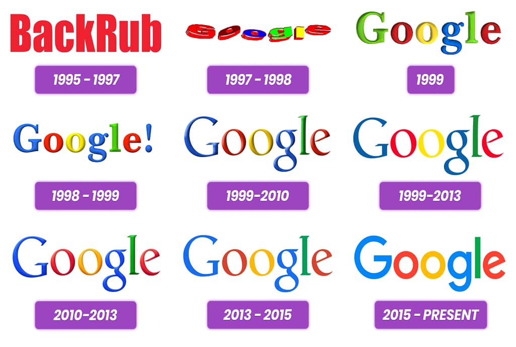
The Google logo didn’t become iconic overnight. Over more than two decades, it evolved from a simple serif wordmark created in GIMP to a modern, mobile-first identity recognised in every corner of the world. Each redesign reflected a shift in Google’s technology, design philosophy and the way people use the internet.
1995 – BackRub the search engine that existed before “Google”
Before the Google name was ever born, Larry Page and Sergey Brin were working on a research project called BackRub — a reference to analysing backlinks to rank websites. It may look nothing like today’s colourful logo, but BackRub laid the foundations for the search engine’s algorithm and eventually inspired the creation of Google as we know it.
1998 — The First Prototype
Sergey Brin created the original logo in GIMP. It was playful, heavy and very “90s” — shadows, bevels and lots of personality. The colour sequence was already there, and the friendly tone set the foundation for everything that followed.
1999–2010 — The Classic Serif Era
Google refined the typography, softened shadows and stabilised the colour palette. This is the logo most people remember from the early search engine days — formal enough for a growing tech company, but still fun and approachable.
2013 — Flat Design Takes Over
The internet shifted towards minimalism. Gradients and shadows disappeared across UI design, and Google followed suit. The 2013 version removed depth and embraced a clean, flat look that worked perfectly across screens.
2015 — A New Identity for a Mobile World
The most dramatic change came with the introduction of Product Sans, Google’s custom geometric sans-serif font. This update made the logo lighter, more modern and far more readable on small displays. It signalled the shift from “search engine” to a global ecosystem of apps, services and devices.
2025 — Subtle Refinements, Strong Identity
Today’s Google logo remains almost identical to the 2015 version. Minor colour adjustments and micro-refinements to the “G” icon ensure consistency across wearables, apps and high-resolution screens, but the brand DNA hasn’t changed. The simplicity is the strength.
What Each Google Logo Colour Represents
The colours in Google’s logo aren’t just visually appealing — each one carries a strategic meaning that reflects the brand’s personality. The palette blends trust, creativity and a touch of rule-breaking, making the logo instantly recognisable across the world.

Google Logo Colours and Their Meaning
Symbolism: Trust, reliability, technology.
Why it matters: Anchors the brand and builds credibility.
Symbolism: Energy, boldness, activity.
Why it matters: Adds contrast and brings dynamism to the logo.
Symbolism: Optimism, creativity, friendliness.
Why it matters: Balances the palette and adds warmth and playfulness.
Symbolism: Rule-breaking, innovation, individuality.
Why it matters: The only colour breaking the sequence — a subtle nod to Google’s unconventional approach.
What Makes the Google Logo So Effective?
The Google logo isn’t just famous because billions of people see it every day.
It works because it follows a set of timeless design principles that make it instantly recognisable, emotionally positive and easy to understand — even for children. This simplicity is exactly why it became one of the strongest digital identities ever created.
Here’s why the logo is so effective:
1. It’s simple enough to remember instantly
There are no symbols, gradients or complex shapes. Just clean typography and four bright colours. This makes the logo easy to recall and easy to reproduce — two essentials in branding.
2. The colour palette triggers positive emotions
Bright primary colours feel friendly and universal. They remove the “corporate stiffness” seen in many tech brands and give Google a warm, human personality.
3. It scales perfectly across every screen and device
From the Chrome browser tab to Android phones, smart speakers and 4K TVs — the logo looks crisp and consistent everywhere. This was one of the core reasons behind the 2015 switch to a geometric sans-serif style.
4. It reflects Google’s product experience
Google products are known for being clean, fast and intuitive. The logo mirrors that philosophy: minimalism on the outside, innovation on the inside.
5. It stands out from competitors
While most tech companies rely on blue-heavy branding to appear serious and trustworthy, Google embraced a playful mix of colours. This single decision helped the brand feel more accessible and creative.

A Fun Story Behind the Name “Google”
Before the colourful logo became iconic, the company needed a name — and the story behind it is almost as playful as the brand itself. Originally, the founders considered the term “googol”, a mathematical expression meaning 10 to the power of 100 — a number so huge it symbolised the scale of information they hoped to organise.
During a brainstorming session at Stanford, one of the colleagues accidentally misspelled “googol” as “google” when checking domain availability. The typo turned out to be memorable, catchy and far easier to pronounce globally. Larry Page liked it instantly, and the name stayed. In a way, the entire brand began with a small mistake that led to something better — a theme that perfectly matches Google’s curious, experimental spirit.
Today, the name “Google” is synonymous with searching the internet, learning, exploring and discovering answers in seconds. The playful colours in the logo reinforce the same idea: a vast universe of information presented in a simple, human-friendly way.

Branding Lessons UK Businesses Can Learn From Google
Google’s logo may look simple, but the thinking behind it reveals a masterclass in modern branding. And while most UK businesses don’t need a global identity seen by billions, the principles behind Google’s design can be applied to any company — whether you’re running a local service, an online shop or a growing national brand.
Here are the most valuable branding lessons UK businesses can take from Google’s colourful identity:
1. Simplicity builds trust
The strongest brands aren’t complicated. Google proves that a clear, minimal identity communicates confidence and professionalism more effectively than a complex design. A simple logo is easier to recognise, easier to remember and far more versatile across digital platforms.
2. Consistency creates recognition
For over 20 years, Google kept the same colour palette. Even as the typography evolved, the visual core remained untouched. This consistency is a major reason why the brand is instantly recognisable.
For UK businesses, this means avoiding constant rebrands and instead focusing on a stable visual identity that customers can get attached to.
3. Colour psychology still matters
Blue for trust, red for energy, yellow for optimism, green for creativity — Google uses each colour strategically to express its personality. UK brands can achieve the same effect by choosing colours that reflect their values and evoke the emotions they want customers to feel.
4. Design should support the user experience
Google’s 2015 redesign wasn’t just about style — it was about clarity, readability and performance on mobile devices. Good branding today must work on every screen and load fast. This is especially important for businesses relying on local search visibility and customer conversions.
(If your own website or brand identity feels outdated, improving design and user experience can make a bigger difference than most companies realise — more about that later.)
5. Don’t be afraid to stand out
The green “l” shows that even a small, unexpected detail can make a brand memorable. Most UK companies tend to follow “safe” design rules. But sometimes the thing that breaks the pattern is exactly what makes people stop and notice.
6. Your brand should reflect your personality — not the competition’s
Google became iconic because it embraced playfulness instead of copying the serious, corporate aesthetic of other tech giants. UK businesses can learn from this: authenticity wins. Customers connect with brands that feel human, not generic.
7. Strong design directly supports business growth
Google’s clean identity reinforces trust, which influences clicks, sign-ups and product usage. Branding isn’t just decoration — it’s a conversion tool. A visually modern, well-built website can drastically improve engagement and business results.
And to be fair, many small UK businesses still struggle with outdated branding, slow websites or visuals that don’t reflect the quality of their service.
A refreshed, user-friendly design can instantly elevate how customers perceive your business — and that’s something we help clients with every day at SocialBerry Web Design

Final Thoughts on Google’s Logo and Its Colours
The story behind the Google logo shows how powerful simple design decisions can be. A handful of bright colours, a clean typeface and one bold choice — the green “l” — created a visual identity recognised everywhere, from London to Los Angeles. Understanding the Google logo colours meaning helps explain why the brand feels so accessible: it’s a combination of trust, creativity and a subtle touch of rule-breaking that perfectly reflects Google’s personality.
For UK businesses, the lesson is straightforward. Great branding doesn’t need complexity or noise — it needs clarity, consistency and a design that genuinely supports the user experience. When colours, typography and layout work together, your brand becomes more memorable, more trustworthy and far more effective online.
Google didn’t become iconic because its logo was loud.
It became iconic because its logo was right.
don’t be green about Google’s logo


